
Why Your Portfolio Is Lying to You
What you’ve been led to believe about interest rates and gold is a smoke screen for 20 years of real stagnation. Here is the structural proof that the consensus is dead wrong.
This may be the most important macro framework I have published to date.
It challenges many of the most widely accepted macro assumptions of the last decade — and it does so based on structural intermarket evidence, not opinion.
This piece is not contrarian for the sake of being contrarian, this is a macro framework based on a fundamental conditional alignment with key relationships between markets. This is an extremely important point to understand for any long term investor and will show you why the consensus view point is potentially deeply flawed.
What is forming right now is a rare macro alignment between gold, the dollar, interest rates, and equities. This is not a short-term trade setup. It is not a call for next week or next month. It is a structural condition that has only appeared a handful of times in market history. Each prior instance marked the end of one major macro regime and the beginning of another.
The dominant view today is clear: currency debasement is permanent, hard assets will outperform, stocks are in a bubble and the financial system is in slow-motion decline.
But when you step away from headlines and examine the actual asset relationships beneath the surface — stocks relative to gold, gold relative to real rates, the dollar relative to liquidity — the data tells a very different story.
This is not contrarianism for the sake of being different. It is a serious examination of market structure that suggests the consensus trade may be closer to completion than continuation.
And if this rotation resolves the way it has in prior cycles, the implications for long-term wealth creation will be enormous.
The Dollar Is Reinventing Itself Not Falling Apart
If this macro shift is forming, it won’t begin with headlines. It will show up in relative strength relationships. And that means we start by looking at the dollar, not as a political symbol, but as a benchmark of global capital flows.
The widely accepted assumption is:
dollar down = risk assets up
and dollar up = bad for risk assets.
But a simple review of the dollar verses the DOW will immediately tell you, that is not true.
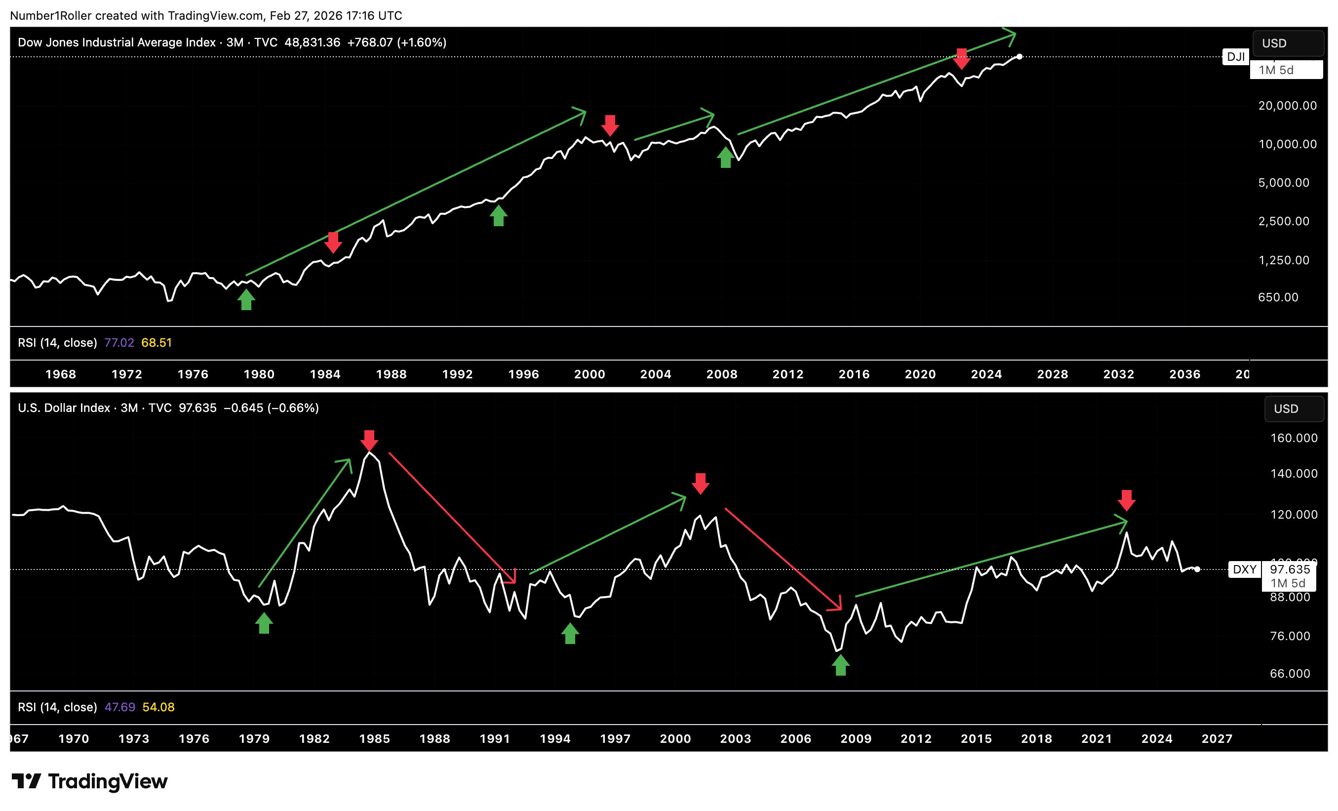
The arrows on the DJI above directly correspond to the major highs and lows in the DXY. It is clear that bottoms in the dollar coincide with bottoms in the DJI. As where tops in the dollar are more ambiguous with no clear correlation to tops in the DJI.
There is no evidence in this chart to support the idea that a weaker dollar is good for risk assets and equities. In fact it would be quite the contrary where bull markets in the dollar coincide with big upswings in the DJI.
So what then is the real driver of a weak and strong dollar?
For that we have to look at Gold versus the dollar.
When gold is up the dollar is down and when gold is down the dollar is up.
This is a much tighter inverse relationship than the dollar versus stocks or risk assets like BTC. Take a moment to see this in the chart.
So if gold has been in a 10 year bull market and the dollar has been losing ground to gold since the 2021 top. What then, are other assumptions that could be wrong?
How about the fact that everyone is calling for the collapse of the dollar, while simultaneously predicting a huge continuation of the gold bull market up to 10k per ounce.
While yes, these could both be true if that were to happen, the reality is that this trade has become way too overcrowded at what has already been a 10-20 year bull market in gold returns.
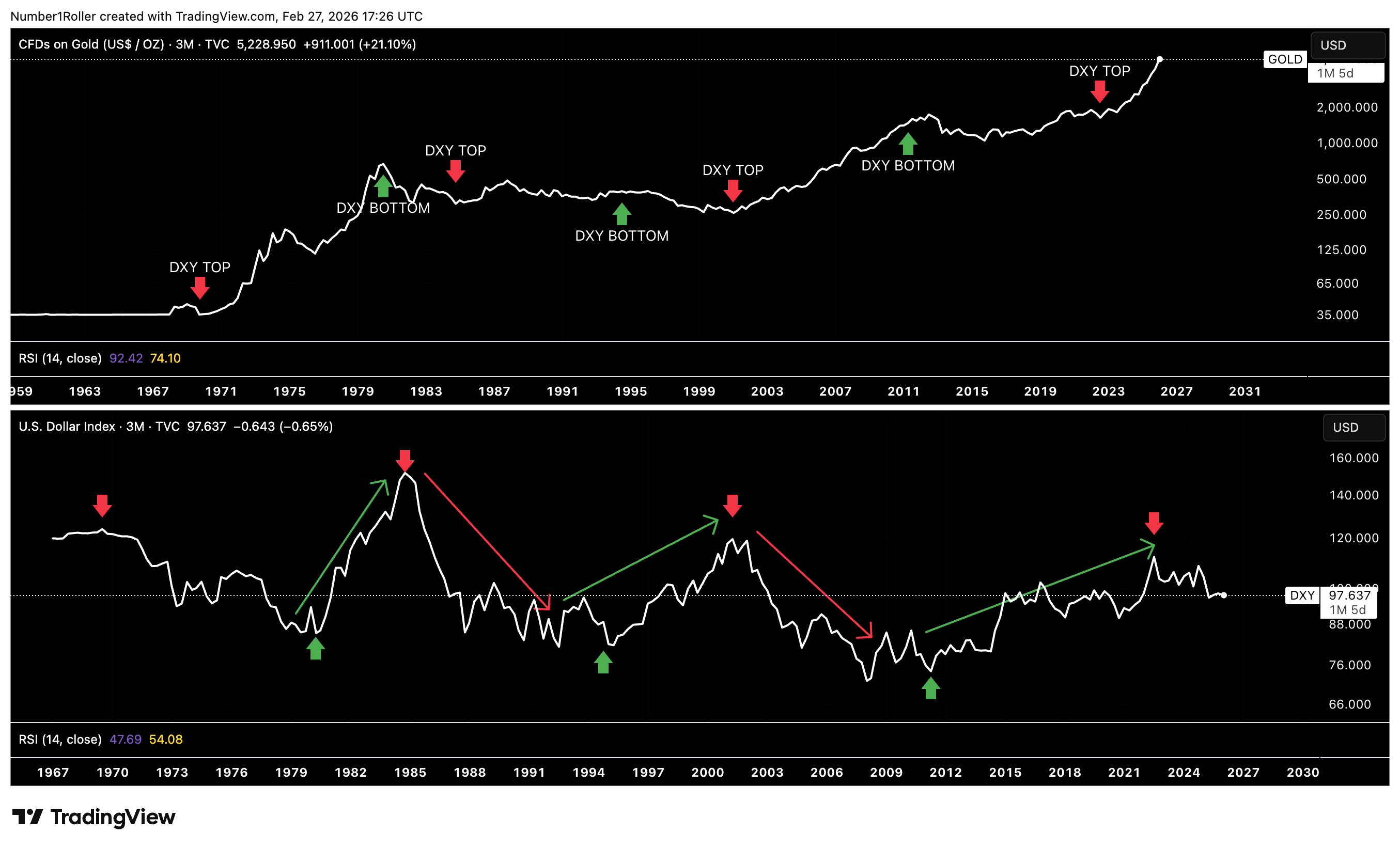
Remarkably, these same conditions were present in both 1980 and 2008, the other two moments when gold marked major secular tops and both equities and the dollar carved out significant lows.
In each instance, sentiment was overwhelmingly one-sided. The consensus was fixated on debasement, inflation fears were elevated, and the belief in endless hard-asset outperformance felt unquestionable, much like it does today.
Yet, if we step back and take an objective look at the chart of the DXY, you can see it’s doing the same pattern it has done since the 2008 lows.
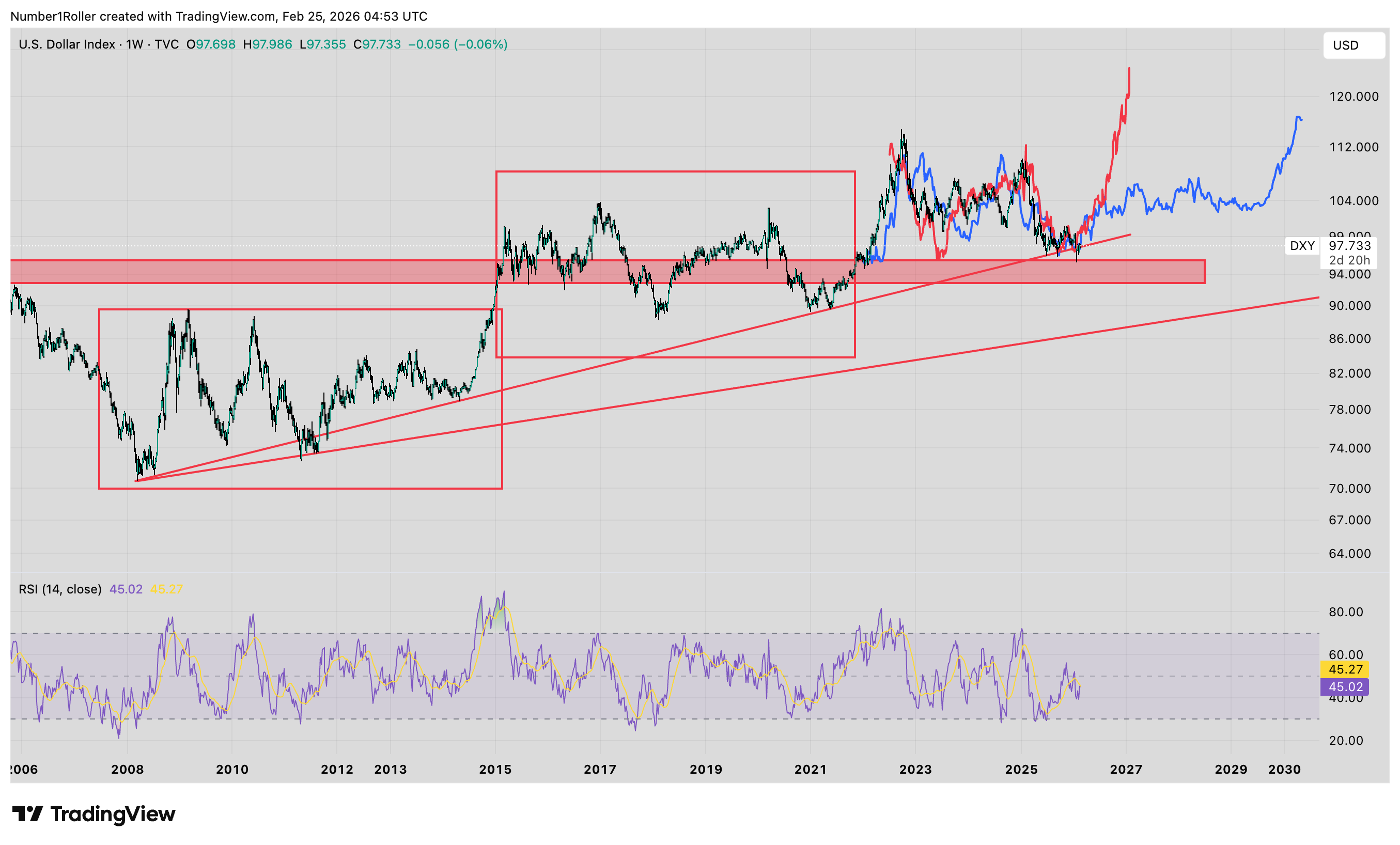
In both prior instances, the dollar had two significant peaks followed by a drop down to the range lows and a sweep of support at previous range highs. That’s exactly the same pattern its in today.
But how could this possibly be that the dollar is not actually going to hell and the global regime isn’t shifting? They told us we are in a currency debasement crisis and the US is losing global superpower status.
Well to answer that theres a lot we have to consider. For starters I want to share this Economist cover from last month.

This is very interesting depiction of the dollar as a snake to say the least. Many of you are probably aware of the magazine cover trading theory but here we can go a bit deeper into the symbolism.
Just last month we saw the Chinese new year bring an end to the year of the snake. But the real symbolism behind the snake year ending is that snakes shed their skin.
In other words when the snake year ends, the idea is that you are supposed to evolve to a better form by shedding off your old skin, metaphorically speaking. So is it just a coincidence that they decided to use this cover? I think not.
Before we look any further into the current situation let’s remind ourselves that the US has reinvented itself many times over throughout its history in a great 80 year cycle.
Beginning with the revolution in 1780, then the Civil War in the 1860s, followed by World War 2 in the 1940’s, which brings us to today in the 2020s.
This is why the US can remain a dominate super power for decades to come because unlike many empires of the past the US has shown a unique ability to evolve.
This could not be more apparent than if we look at the global restructuring we have seen in the last two months with the US seizing control of Venezuelan oil, threatening to take over Greenland, threatening Cuba, and ultimately trying to wrestle and reign in Iran, there is one clear theme going on and that is the struggle to secure massive amounts of natural resources that will be needed to build out the ai revolution.
From oil and rare earth minerals to critical shipping routes and transportation lanes, this broader tariff strategy and overall aggression is about far more than trade balances — it is about leverage and keeping the USD on top.
The US once weaponized the dollar through direct sanctions, that was the old model. Now the strategy is evolving. Instead of targeting countries outright, control is shifting toward strategic chokepoints in energy, critical resources, and most importantly, compute.
The leverage is no longer just exclusion from the system, but control over access to the infrastructure that powers global trade and the AI revolution.
The message is clear, if you want entry into global markets, if you want access to the compute layer defining the next technological era, you operate inside the dollar framework. It’s the same reason the US has to be the global super power in crypto because they are aiming to keep the world on a USD (stablecoin) system.
USD dominance isn’t being imposed the same way anymore instead its reinventing itself. It’s being engineered through control of the inputs that matter most.
The DXY is not failing, but rather shedding its old skin and reinventing itself for a new era of American power.
But the dollar alone doesn’t tell the full story. Its movements only make sense when viewed against the asset it has historically competed with for monetary supremacy: gold. If the dollar is repositioning, gold will be the confirming variable.
Gold Is the Macro Indicator
Gold is the ultimate piece to this puzzle we are putting together. We already covered how the DXY does not in fact tell you much about the stock market regimes but is instead a much better counter to gold regimes.
That said, there are also many false assumptions about GOLD, what it is, and how it moves markets.
The mainstream thinking is that gold is bad, whenever its in a bull market that means a crisis is brewing, wars, currency collapse etc etc. Now, I’m not saying it doesn’t go up when wars or crises happen but it is not the root cause of gold going up.
Again, a simple observation will show you that the prevailing narratives around gold are just not true.
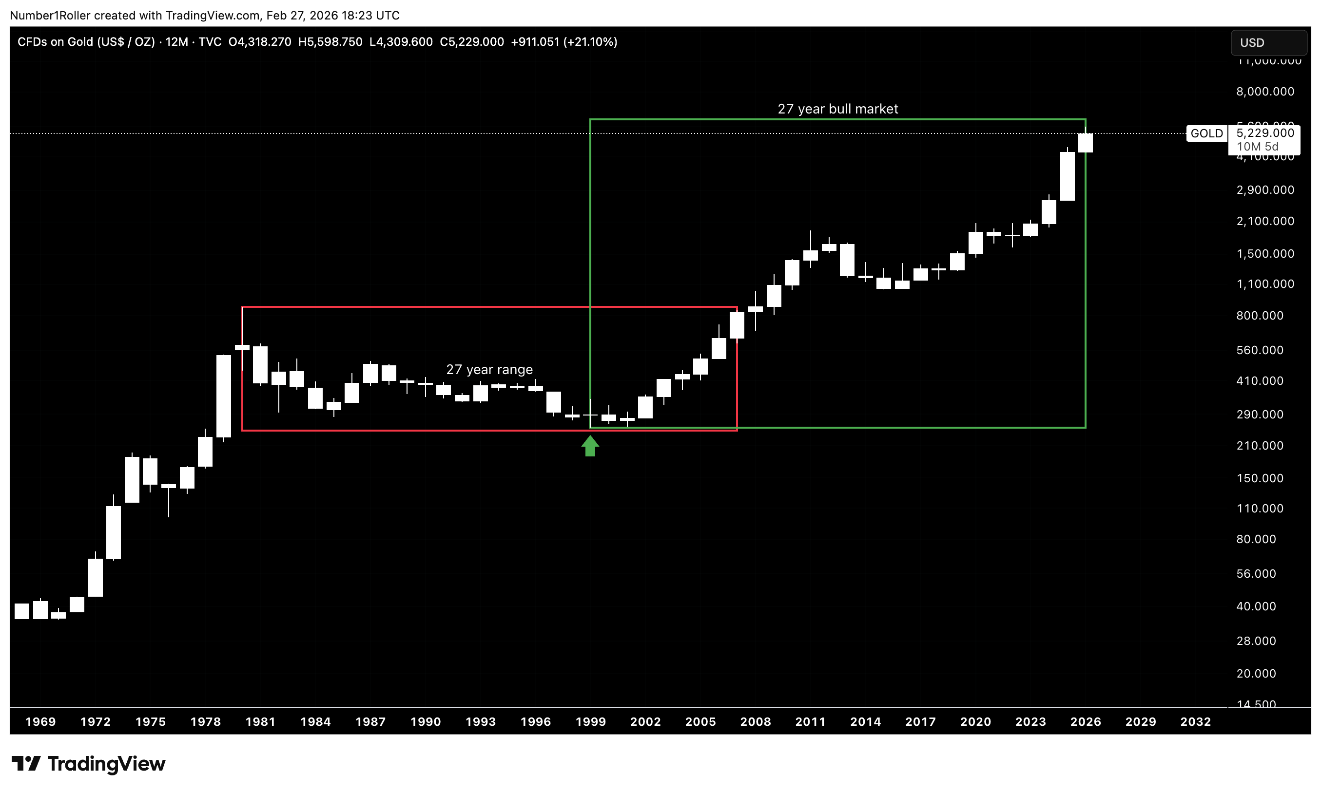
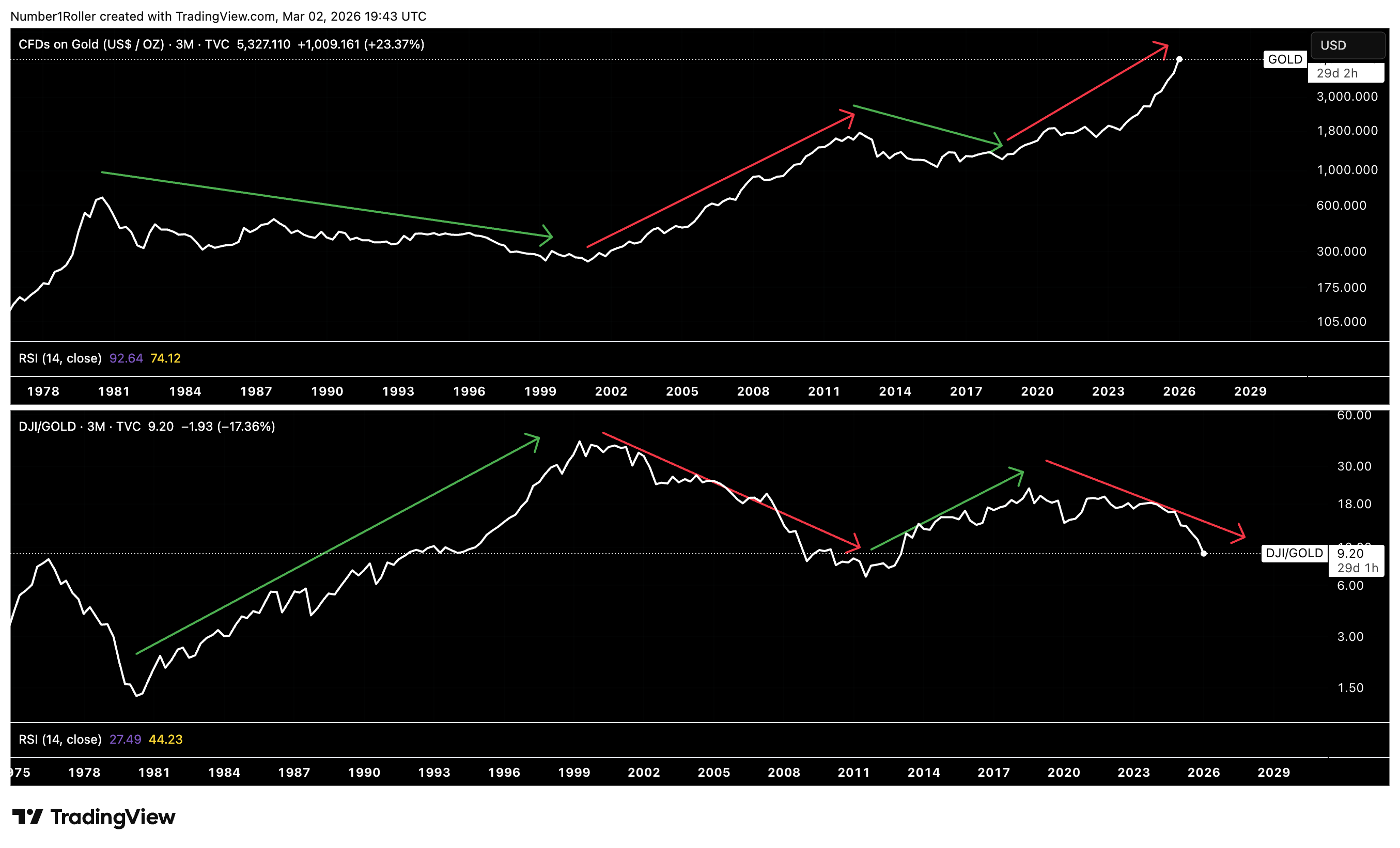
Gold has had three major bull markets in its history if you include today’s bull market. The previous two bull markets lasted around 120 months which puts today’s gold market squarely into that time factor. Will this be a top? We don’t know yet, but the cycles suggest its closer to the end than the beginning.

Taking our time analysis a bit further and looking at the time it took gold to top, from the time it broke out of the green consolidation boxes in the image below, and you will see we are again in a late stage time frame.
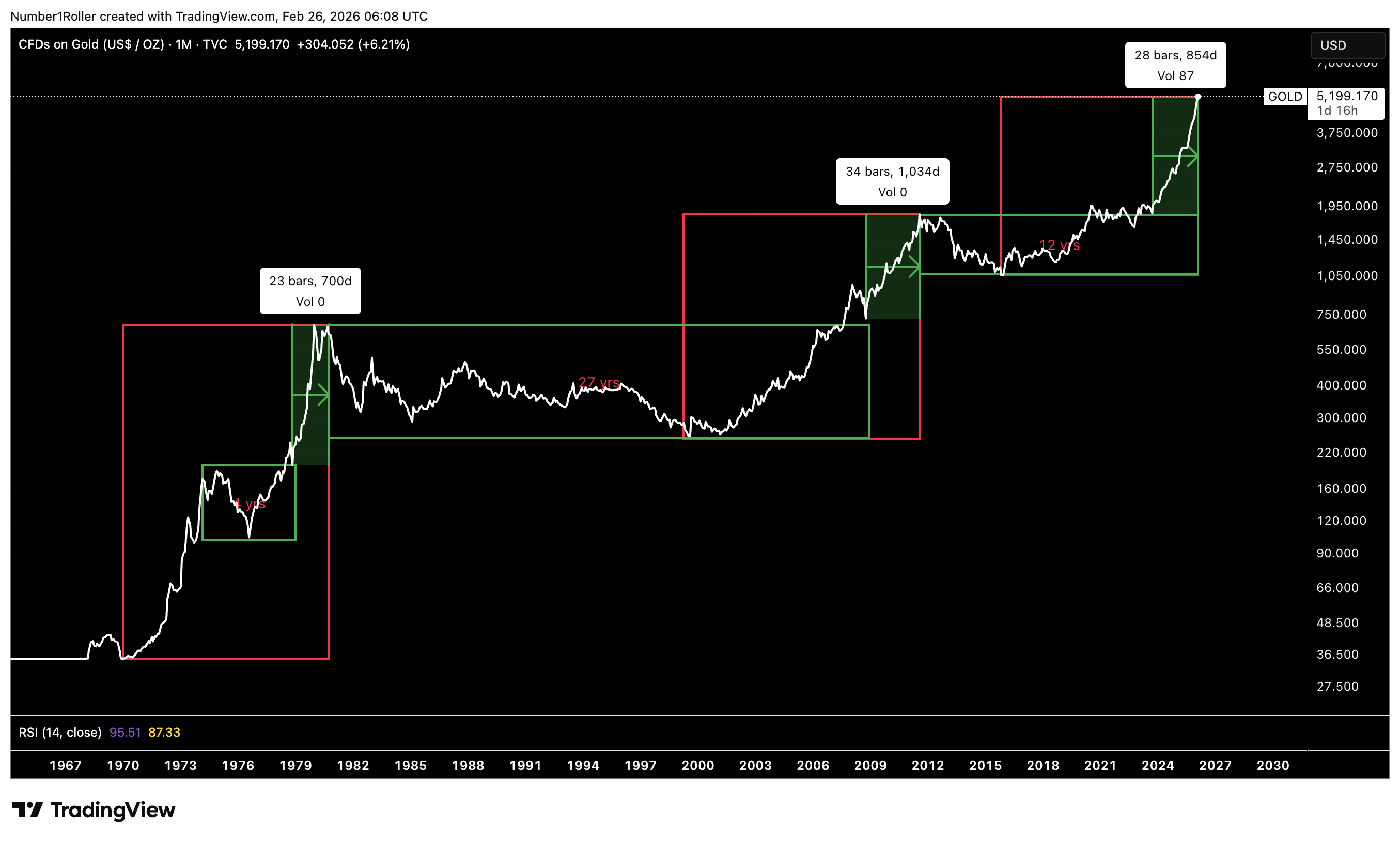
In the first two cases, it was 23 months and 34 months respectively. The average of those two times is exactly 28.5 months which is exactly where we are now…
Finally, you will note that gold had a 27 year range after the 1980 top and now has been in a 27 year bull market off the 1999 bottom. Quite the confluence of 27 to 28 time cycles coming together.
But if gold is approaching a major top, what then, does this tell us about the overall market cycles?
Well, as I said before, most people have been misled about the role of gold and nothing makes that more apparent than looking below at the chart of the DJI index over the chart of gold.
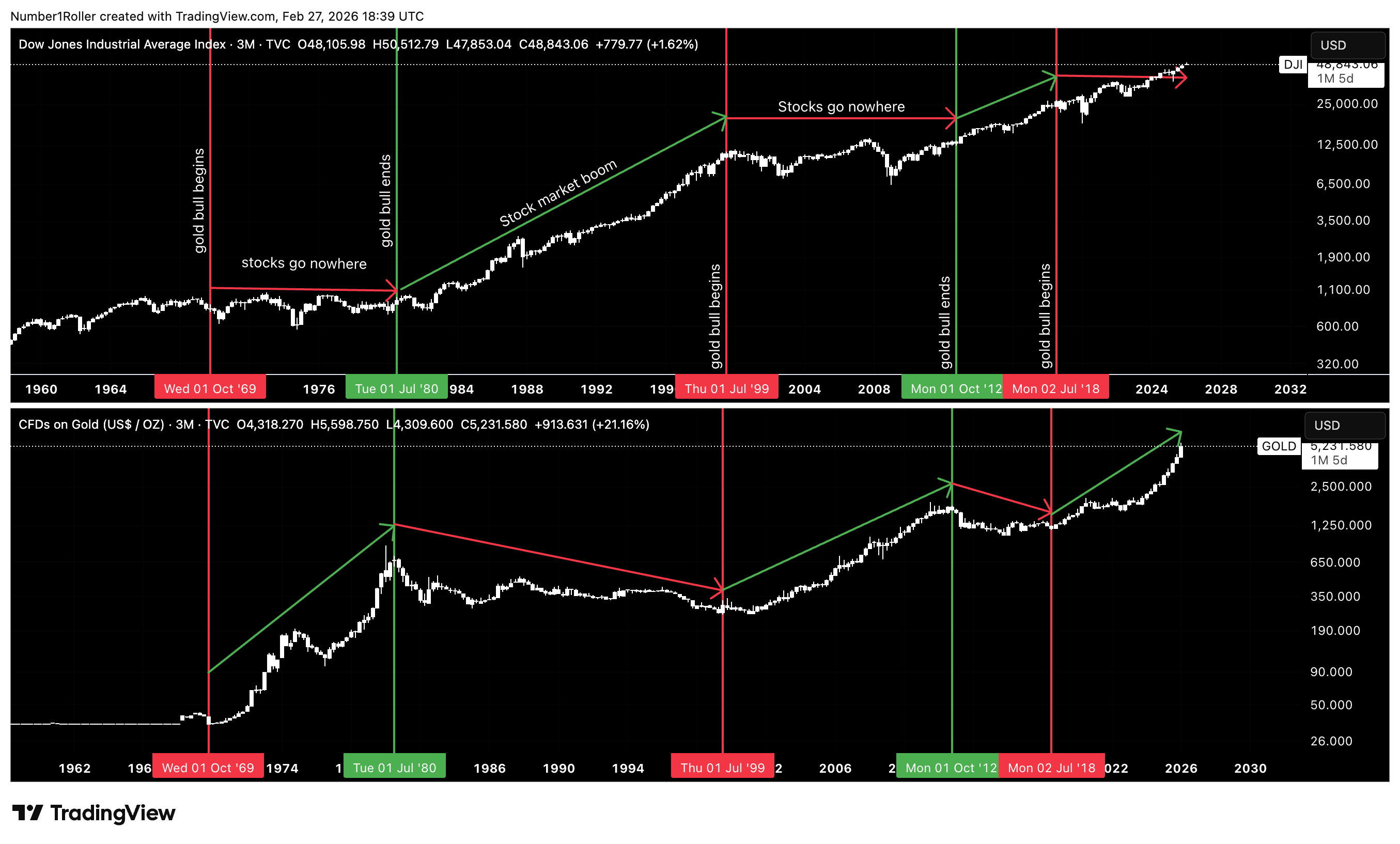
When we do this, we get a very clear picture just like the dollar relationship, that when gold is in a big bull market stocks effectively go no where. And conversely, when gold tops stocks begin huge bull markets (after an initial correction phase).
But even this image is not enough to understand whats going on here. Because on the surface, this has been the correct viewpoint up until now as you can see the 2018 bottom in gold where stocks have also gone up…or have they?
This is an important distinction we will cover later in this article when we review equity performance relative to gold.
But for now its enough to see that major tops in gold actually start major bull markets in stocks (after an initial pull back) which is not what people have been led to believe.
Said another way, gold going parabolic actually signals that we are getting closer to a new secular bull market in stocks.
But why is that the case?
Well, if we think about what gold really is, and who holds it, it may become more clear.
Gold is the largest single asset in the world at a market cap of over 30 trillion dollars. For reference the entire market capitalization of all US stocks is around 50 trillion dollars.
So let’s think about why thats so important and why it actually enables the major macro regime shifts that last 20+ years.
Who is the largest holder of Gold in the world? It’s central banks.
So who benefits the most when the price of gold goes on a 10 or 20 year bull run? The central governments.
So while everyone in crypto thinks the government should have BTC as a store of value, the reality is that they already carry the most gold in the world and when gold outperforms everything the way it has they actually get much wealthier in real terms even if it doesn’t appear so in nominal debt terms.
So the smoke screen is that the government has the ability to devalue their own currency while simultaneously holding the one asset they need to maintain wealth in REAL terms.
So could it be the case, that even though debt skyrockets in dollar terms they are knowingly holding the one instrument they need to keep pace with it? It would appear so.
Which is why, when the ultra wealthy gold holders have secured decades worth of real value capture while dangling the nominal value thinking in front of everyone else, they can then open the spigots for real returns to catch up to gold returns for decades at a time.
Understanding gold’s cycle is critical because it dictates where real returns reside. And that brings us to the most misunderstood part of this entire framework — the difference between nominal gains and real wealth creation in equities.
The Illusion of Nominal Wealth
Before I dive into this section lets just be clear that everyone sees how I’m defining real and nominal returns.
The generally accepted economic view is that real returns are returns adjusted for inflation. In other words if you have a 5% return and inflation is 2% the real return is 5%-2%= 3%.
Nominal returns are returns not adjusted for inflation. So a 5% return is a 5% return without accounting for any inflation.
However, for the purposes of this article real returns are going to be considered returns adjusted for gold as a store of value.
In other words if gold is the store of value and not USD wouldn’t you want to know if you are getting richer in gold adjusted terms rather than dollar denominated terms? Because if your assets aren’t appreciating against gold then the logical answer would be to just own gold…
So lets dive in.
On the surface it would appear that stocks have been in a great bull market since the 2009 bottom.
But upon further review we may see why that is all just a smoke screen to whats really going on under the hood.
Looking at the below chart of the Dow Jones industrial average going back to 1880s we can see that there have only been four secular bull markets in history. Each of these bull markets was preceded by a decade long consolidation.
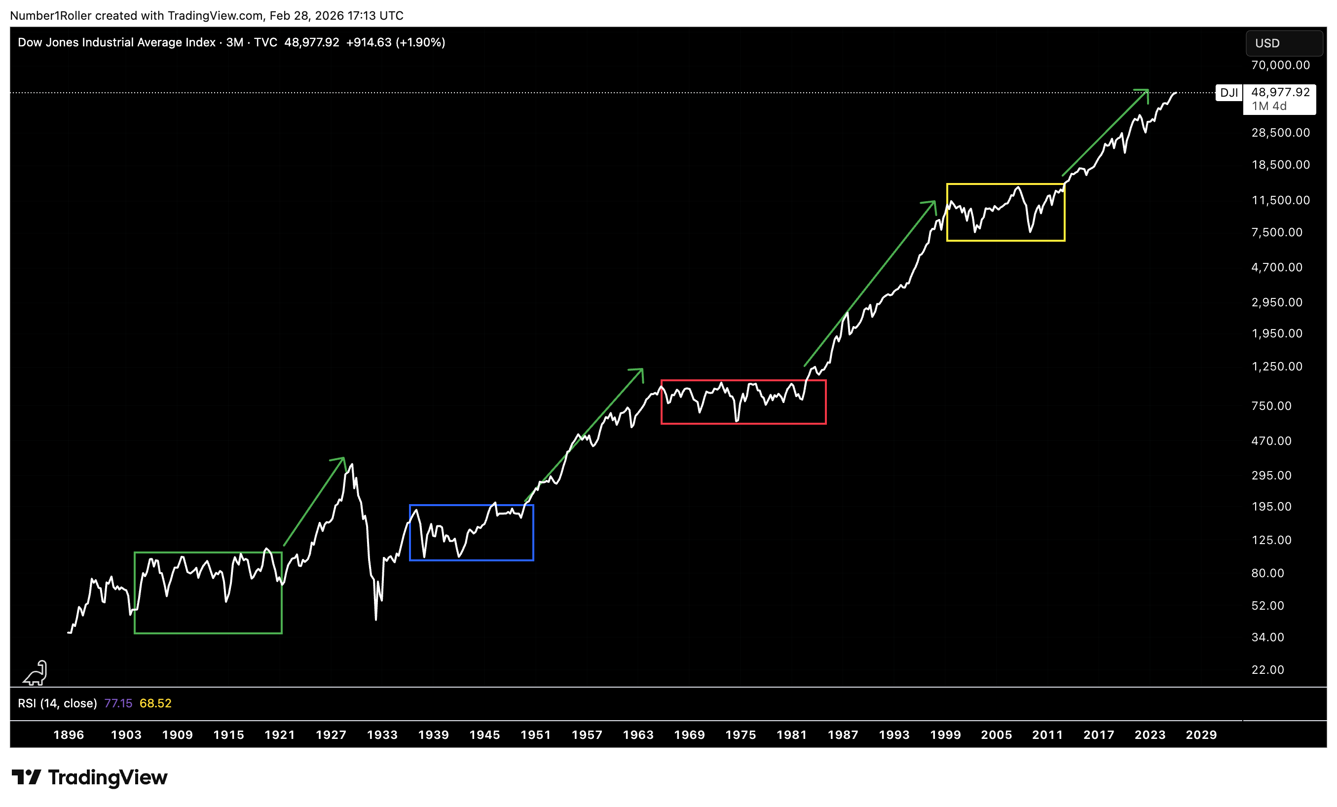
So right off the bat we can tell something is off about this structure because isn’t everyone under the impression that 2008 was a great bubble? Thats not at all what the chart actually says. Of course some sectors like housing may have had a moment, but the reality is that it was clearly not an asset bubble as indicated by the charts.
How can we confirm this? Well again, by looking at gold performance against equity performance the intermarket relationships become quite clear. Each colored box below on gold reflects its same colored box on the DJI.
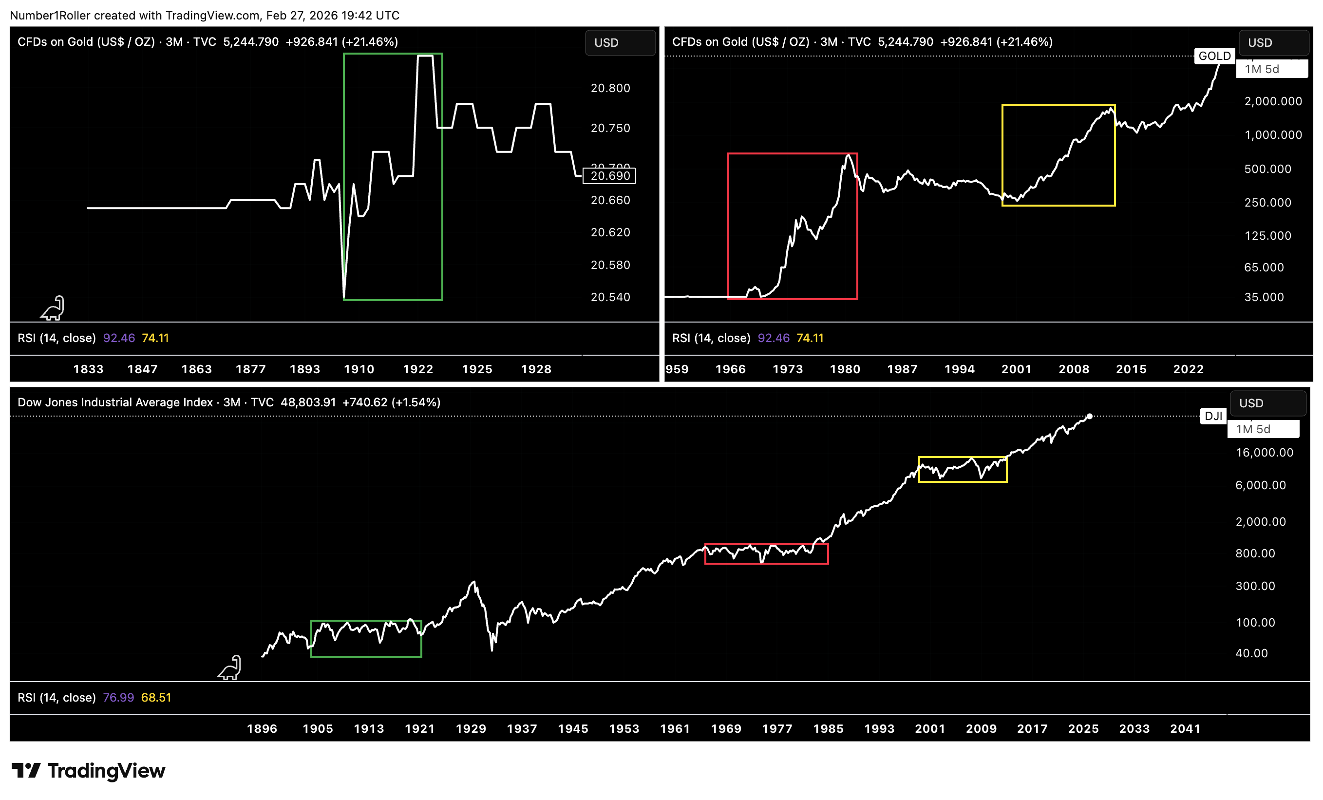
Each one of these long sideways periods in the stock market coincided exactly with major bull markets in gold. When gold topped, secular bull markets of REAL returns began in equities. We’ve already proved this.
So now lets turn our focus to the actual chart of the DJI index paired against gold and this relationship becomes even more startling.
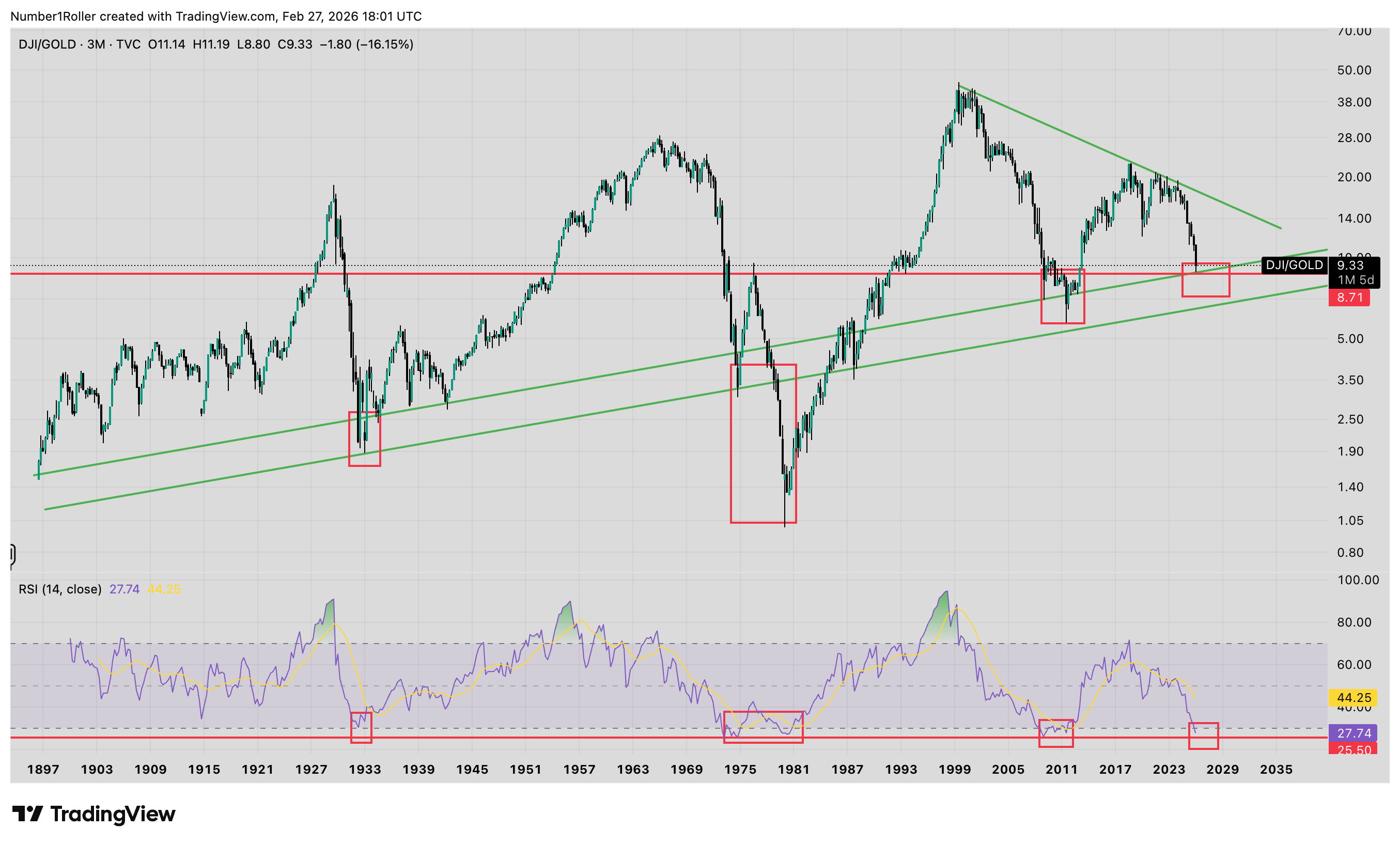
There is a lot we can take away from this chart so lets go through the observations
There have only been 4 times in history where equities have truly outpaced gold on a macro scale. Late 1920’s. 1932-1966. 1980-2001. 2011-2018.
Equities valuations have never come close to passing their 2000’s high relative to gold and in fact topped out against gold in 2017/18 or nearly a decade ago…
This is a 3 month chart and we are now in historically oversold levels relative to gold that has only been seen three other times in history.
Each of these times was a massive bear market bottom in equities which ushered in a macro top in Gold and a macro bottom in real equity returns.
It’s very important to understand whats going on here. Not only is gold at conditional levels for a major macro top, but at the same time equities are at conditional levels for a macro bottom on a relative basis. Now as you can see by the chart this is typically a 18-24 month process. Which means we should see this massive rotation beginning to play out now through 2027.
The key eye opener, is that if you start measuring real returns in assets against a true store of value like gold instead of in nominal terms like USD denominated inflation. You see that we have been in a near 10 year bear market of real returns in stocks. Pretty shocking.
The takeaway is very clear, unless you own the correct stocks on a 10-20 year basis like NVDA or META (to name a couple stocks of the very few that outperformed gold), when gold is in a macro bull market you should only own gold because real returns in other assets get crushed.
The opposite is also true, that when gold enters a macro top you want to be back in equities because thats where the true wealth gets built.
This is a lot to digest and I personally find it very eye opening and contrary to what everyone is taught to believe about gold and real returns from mainstream economics.
Gold is THE store of value and only real returns happen in gold during these periods where nominal returns happen in stocks with few exceptions. When this macro regime shifts as its only done less than a handful of times in history, then you want to own equities for real returns.
This is hard to believe since everyone thinks we have been in a major equities bull market, which we have…in nominal terms, but against real value? It’s clear we have not, at least since 2018.
I find a good analogy would be looking at the stock exchange of Zimbabwe or the price of bitcoin in Argentine pesos and concluding that everyone must be rich in those countries. However, if you paired those same markets against gold you would see a much different picture and the true reality of the situation.
Bitcoin in Real Terms
If gold is the true store of value benchmark, then equities are not the only asset that must be examined through that lens. The same logic must be applied to bitcoin — particularly if it aspires to compete as a monetary asset.
We talked the other week about how bitcoin can act as a store of value and what that may mean for the future of it.
But here let’s look at the real return of bitcoin relative to gold which appears to be the default SOV.

Again, several key takeaways from this chart but the first being the fact that BTC is flat against gold since its 2017 top. Not exactly the 10 year bear structure stock indexes have faced but it also hasn’t gone anywhere over that time period.
In other words, it’s not keeping pace with gold, but at the same time, it is doing better than stocks.
The other thing to note is that just like stocks, BTC is in a historically oversold level against gold while also matching a cyclical time factor for a low.
We now have multiple asset classes sitting at historically oversold levels relative to gold, while gold itself is stretched into historically overbought territory — yet the consensus insists it is headed dramatically higher on the back of money printing and a commodity supercycle narrative. The data suggests the opposite.
When every major asset is historically oversold against gold while gold is extended to extremes, the higher-probability outcome is not an endless continuation of the gold bull market, but the late stage of it — a macro topping process that sets the stage for a broad real bull run across risk assets. That may not be the popular view, but it is what the intermarket conditions are implying.
Real Rates and the Liquidity Pivot
So far we’ve examined relative value between assets. But there is one variable that determines when liquidity shifts between them: real interest rates. This is the pivot point that turns gold regimes into equity regimes — and vice versa.
Since 2022 everyone has become an expert on what the fed needs to do and what rates should be at. But lets look at what this relationship between gold and rates has signaled in the past.
Historically, when real rates are below 2% gold is where the money stays because why be in bonds when you can get a better real return on your gold?
Let’s look at this in the chart below and the relationship couldn’t be more clear. Each green arrow corresponds to each green arrow in all three charts and the same for each red arrow.
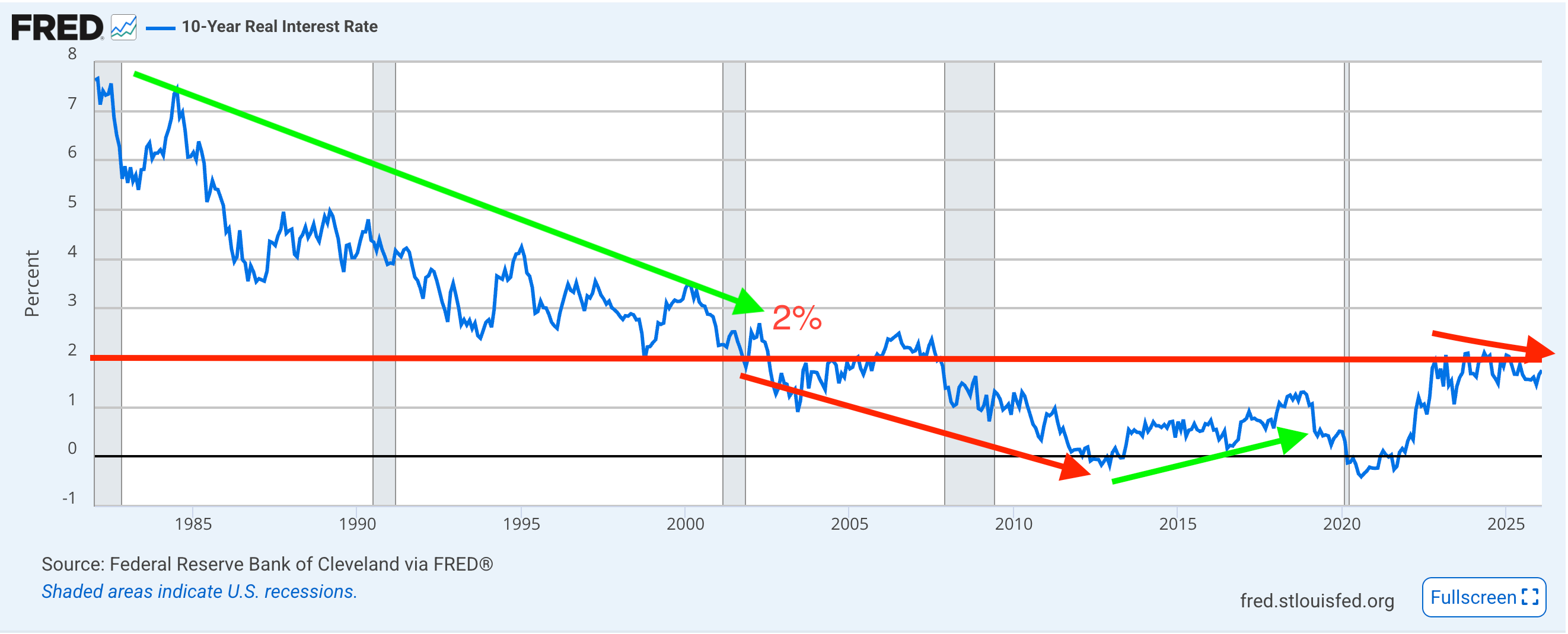
What you see is that during the period of the 80s and 90s rates were going down but ABOVE 2%. This corresponded exactly to a 27 year gold bear market and a 27 year real return bull market in equities. The key is that real rates were ABOVE 2% while going down.
Then everything changed in 2000 when real rates fell below 2% and kept declining. The bond market could no longer keep pace with gold returns. Gold began a massive bull market and stocks returns collapsed against gold.
Then you can see from 2011 to 2018 real rates began to rise again and stocks outperformed gold while gold fell quiet. Then in 2018 it stopped. Real rates fell off again while under 2% and gold resumed to a bull market while stocks have been losing the battle ever since.
You can even see the exact U shape move on rates from 2020 to 2022 corresponded exactly to the U shape move on the DOW against gold. But as soon as real rates stopped rising in 2022 and were still below 2% gold took control and has been in the drivers seat ever since.
The Ultimate Test
In no way can we complete this study without an in depth look at the 1970’s which we’re characterized by rising rates, rising inflation, rising gold prices, and stagnant stock prices.
At first look this would seem to derail our above data but when we take a closer look at what really went down we will see the relationships did exactly the same thing.
The below chart show the relationship between the US 10yr bonds, gold, and then DJI versus gold.
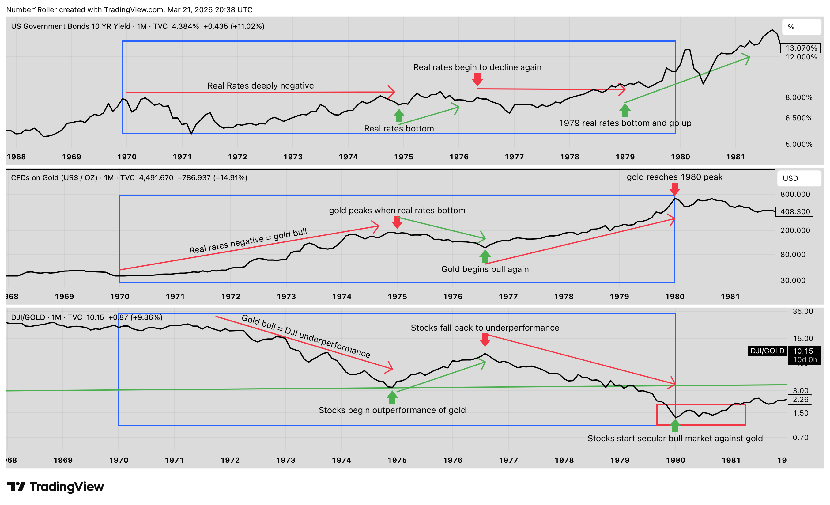
You can clearly see that from 1970 to 1974 rates were rising but real yields were still falling as inflation ramped up. So according to our view real rates declining while under 2% means gold outperforms. Sure enough thats exactly what happened. Gold went up while the DJI went no where and ultimately declined relative to gold.
Then in 1974 what happened? Real rates bottomed and began to rise as inflation peaked during the 1974 oil crisis. As real rates climbed for the next two years, gold declined over the same period while stocks went up.
Then again in 1976 real rates peaked, causing gold to bottom, and stocks underperform for the rest of the decade.
Then as inflation collapsed into the 80’s while rates were still rising, real yields rose and gold made a major peak while stocks hit a major low and began a real secular bull market.
Now Gann called the 50 year cycle the great cycle as it was the culmination of five 10 year cycles. 50 years ago was yes, the 1970s.
So is it any coincidence we find ourselves in a very similar situation today? Trouble with Iran causing an oil crisis, leading to higher inflation, forcing the fed to raise rates, all while gold appears to be in a topping scenario and stocks are massively oversold versus gold?
If these are in fact the conditions, which they do appear to be, then is it a stretch to consider a scenario in stocks like we saw in the 70s with a 2 year lag?
Oil crisis leading to higher inflation this year causes rates to rise leading to a huge bottom in stocks which results in a big move up into 2028 while gold has peaks in 2026 and underperforms. Then the real reckoning happens from 2028 to 2032 and from the 2030s on stocks go into a massive secular bull for 20+ years.
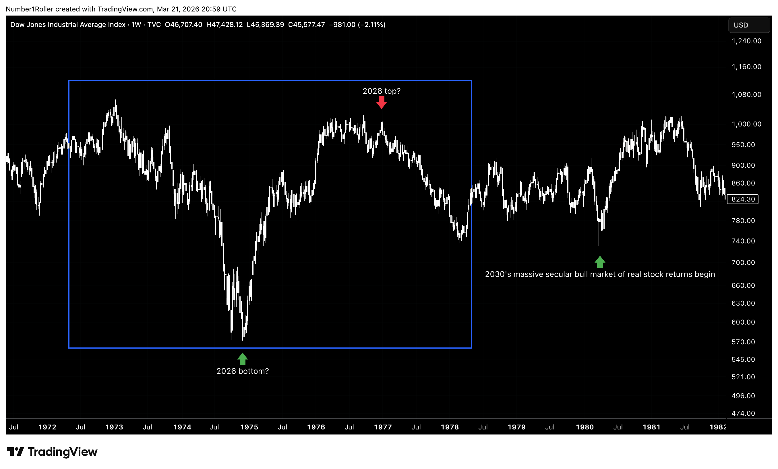
The conditions are eerily similar but only time will tell. What we do know is what to expect when these relationships do turn a corner.
The Verdict
The mainstream economic theory says low rates are good for business and good for stocks.
But once again, a simple observation of the actual intermarket relationships suggests otherwise. Gold has consistently been the preferred asset in low-rate environments, and that only tends to change when real rates begin rising meaningfully or move above roughly 2%. In other words, the issue is not simply whether rates are falling or rising in nominal terms. What matters is whether the bond market is offering a real return strong enough to compete with gold.
That makes perfect sense if you stop thinking about gold as a crisis asset and start thinking about it as the global liquidity engine.
When gold is outperforming real yields, it functions like a vacuum for liquidity. Large pools of capital know they cannot earn durable real returns elsewhere, so capital concentrates in gold. That is why gold bull markets are so powerful and so persistent. They are not just emotional reactions to fear. They are structural periods where liquidity has nowhere better to go.
That dynamic only changes once rates rise enough to restore competition. When real rates move high enough, particularly above that 2% threshold, capital can begin flowing back into bonds. And from there, it can ultimately spill back into equities. That is the real pivot. Not lower rates helping risk assets, but higher real rates pulling liquidity out of gold and redistributing it across the financial system.
So where is the misunderstanding?
The popular assumption is that stocks and crypto should perform best when rates are falling. But the historical relationships do not support that view. Lower rates may sound supportive on the surface, but if they also allow inflation to stay elevated or reaccelerate, then real returns in bonds remain too weak to challenge gold. In that environment, liquidity stays trapped in the gold regime.
That is why the real pro-business backdrop is not simply lower rates. It is higher real rates paired with contained inflation. That is the condition that allows liquidity to leave gold, move into bonds, and eventually expand outward into equities and other productive assets.
This is also why a major policy mistake may be forming. Trump has now installed a new Fed chair who appears committed to cutting rates, but that may prove to be exactly the wrong move at the wrong time. If rate cuts arrive into 2027 and inflation begins rising again, the market may start discounting that outcome well in advance. The result could be a selloff driven not by tight policy, but by the realization that easy policy is preventing real yields from becoming competitive.
In that scenario, bonds still do not offer enough real return, gold retains liquidity dominance, and the broader rotation into productive assets gets delayed.
That, in my view, is the real macro pivot to watch into 2027 and 2028.
And it is all right there in the intermarket relationships above.
When Gold Tops, Regimes Change
When you connect the dollar, gold, equities, bitcoin, and real rates, a single relationship sits at the center of everything.
Gold is the fulcrum of the system, and real interest rates are the force that tips it.
I have tried to punch holes in many ways in this framework but there’s simply no denying it. The main argument is that stocks still go up and people have gotten richer since 2000 but thats just not true.
This is extremely important to understand if you are a long term investor in a retirement account or any vestment period that is longer than 10+ years.
At the 2002 low the SPX traded at 729 today it trades at roughly 7,000 or a 811% gain in 24 years. Gold on the other hand, had you bought that at the 2001 lows, is up 2,100% in 24 years to $5,500.
A $100,000 dollar investment in the SPX would give you $811,000 today. A $100,000 dollar investment in gold would be worth $2,100,000 in the same time period. A $1.2 million dollar difference.
You think that might be important to know if you are 25 year old college graduate and putting all your money into the indexes every month? It’s clear, it makes all the difference in the world.
So as long term investors think they are safe just throwing money at the SPX every two weeks they have been taking in the shorts for 20 years without even knowing it. On paper they are up, but in real terms, against real value? they are down over 50% in two decades. Thats a big deal.
Even in the last 10 years, unless you owned the Mag 7, you have been getting smoked by gold.
The verdict is clear,
When gold enters a secular bull market, real returns across financial assets compress. Liquidity gravitates toward the monetary asset that cannot be diluted. Nominal gains may appear impressive, but when measured against gold, wealth creation stalls. That is the environment we have largely been in since 2018 if not since 2001.
However, this is not the time to panic and rush into gold. As demonstrated above it would be more likely at this point in time that this major 20 year bull market is coming to a close sooner than most gold bugs will realize
and the implications of that are enormous,
when real rates rise, gold tops — not temporarily, not cyclically, but structurally — and liquidity begins to rotate. The bond market becomes competitive again. Capital flows outward from the monetary reserve asset and back into productive risk assets. That is when true secular equity expansions begin.
This has only happened a handful of times in modern financial history. The late 1920s. The post-1932 expansion. and then again in the 1980s. Each marked the end of a gold regime and the beginning of a multi-decade wealth cycle in equities.
Right now, gold is extended on long-duration time cycles. Equities and bitcoin are historically compressed relative to it. All while real rates are at a pivot threshold that has previously marked major transitions.
This is not about being bullish or bearish next quarter. It is about recognizing that we may be in the late stage of a monetary-dominant cycle and on the verge of a productive capital cycle.
If gold is completing its secular move, then what follows is not another nominal bounce. It is the potential beginning of a real bull market that we haven’t seen in over 20 years — one measured not in weeks, but in decades.
That shift will not happen overnight. It is a process. Gold will top in a long distribution phase after a 10 year run. Equity bases will be forming. The dollar is reinventing itself and liquidity rotates gradually before it accelerates.
This is all what I see coming in the next 18-24 months. A potential policy error by the fed, a sell off in stocks, higher rates, a top forming in gold, and ultimately a new and real bull market beginning in equities and lasting long into the 2030’s and 40’s.
The decennial pattern of this century has been clear 2008-2010 was a rough period 2018-2020 was rough and that setup is emerging again in 2028-2030 as this massive macro rotation takes place. That doesn’t mean we wont see a big move up in stocks before then but it does suggest a big reset button is coming.
Then, when the rotation completes, the opportunity is asymmetric.
The last decade may have been a smoke screen — nominal highs masking real stagnation. The next decade, if this framework is correct, could look very different.
Because when gold releases its grip on global liquidity, capital does not disappear.
It flows.
And where it flows next will define the next 10 to 20 years.
Haven’t seen anyone else say anything like it although it’s frequently said by people that gold has outperformed S&P. Not the reason why tho
Great piece of research.